I’m trying to make the joint more reader friendly. I’d appreciate your feedback. Did I take a step in the right direction or go off the deep end?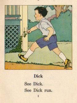
I’ll tell you what I like about this new look: I think the posts are more readable. It had been bothering me for a long time that the block quotes were low-contrast. It was even difficult for me to read them. With this design, the type is at least a bit larger. I just don’t want it to look too Sally, Dick and Jane, if you know what I mean. You’d tell me if it did, wouldn’t you?
I’m not crazy about the background color. Don’t be surprised if it goes from very dark purple to very light yellow in the click of a mouse. I’m going to tend to want it very light so the text in the margins is readable.
Any other comments you’d care to share, I’d be delighted to entertain.
What background colour? I see only white…
Oh, wait up… now i see a sort of cream white
Not so sure I like the hidden links. Aesthetically, it’s nice, but I wonder if it’s going to reduce the number of clicks out. I wouldn’t be surprised.
What do you mean, hidden links?
Overall i like the design. Try it out for a week and see how it fairs.
I shall. Thanks for your input, john.
This post is not a good example. Go to the Chomsky one. It looks like there are no links until you drag your mouse over the text. I like that that makes for a very clean page, but I don’t like that the reader doesn’t know at first glance that there’s hypertext there.
Oh, you mean there’s no underline, or different colour. Yeah, that is odd.
Not too crazy about the leading between the lines in the title font either. It’s too much!
On the home page, there’s a very pale bg color. It was robin’s egg blue, now it’s a hazy sunset.